Late last year, the University of California (UC) introduced a new identity.

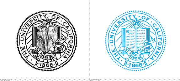
Previously, the UC system only used its seal as its primary visual identifier, where it was abused with impunity. We feel it is an important component of the university’s visual ecosystem. But it is a non-distinctive symbol which serves an important bureaucratic function. Now we limit its use to formal systemwide communications, diplomas, official regental and presidential communications, and other official documents. Many of our campuses, and other universities across the country have limited use of their official seals in similar ways.
From this perspective, this is less of a rebranding exercise, but instead the creation of a coherent, consistent, and relevant brand identity where before there was none.

I’m diggin’ the logo/identity introduction that the team did. It’s creative, and does a great job explaining where things have been inspired from: ((Note: “inspired from,” vs. replacing… The “controversy” sorted out.))
[vimeo]http://vimeo.com/53530934[/vimeo]
The monogram:


Here are old materials with the old branding guidelines:
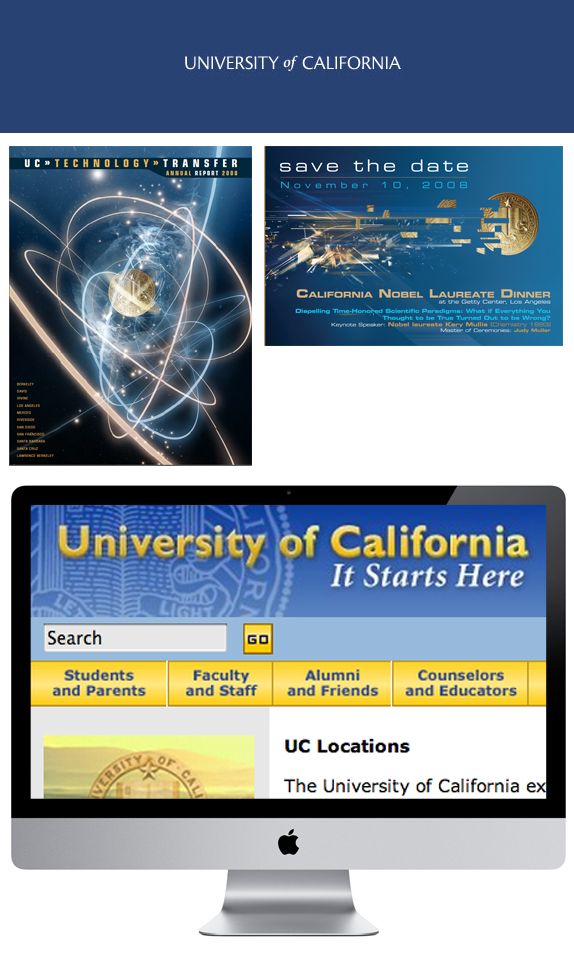
Now here are materials with the new:
The Design team
Art Director and Interactive Designer: Kirill Mazin
Interactive Designer: Matt Glass
Designer: Natasha Foote
Designer: Jason Huang
Sr. Designer: Ethan Davis
Designer: Jose Pantoja
Developer: Adam Mangum
Multimedia Director: Larissa Branin
Sr. Producer: Jess Wheelock
Producer: Zak Long
Creative Director: Vanessa Correa
Source: Brand New & Rock Paper Ink
