I set out to using free, open-source web fonts for a particular project lately. I’ve had bookmarked some articles a while back with some pretty cool combinations that will help the Design process move a long a bit faster. To name a few:
- Design Shack’s 10 Great Google Font Combinations You Can Copy
- Daniel Eden’s Just my type
- Typespiraton
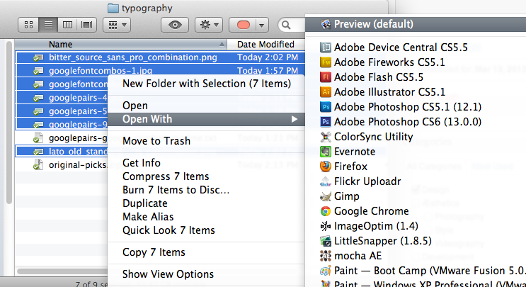
In those articles where screenshots of sample combinations. I just saved them to my local drive for comparison. If you don’t have Adobe Lightroom (for its Survey or Compare views) or Adobe Bridge (for its Thumbnail view) but are on OS X, you can use Preview to compare the stills.

I tried it for this current project. The only caveat is the amount of pieces you can fit on screen. In my case, working on a 13″ Macbook Pro, I was able to view 6 at a time.
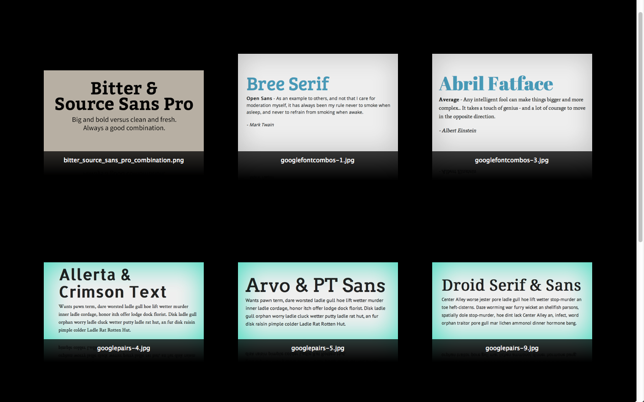
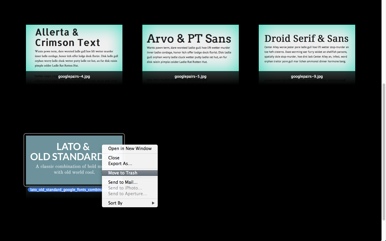
Within it, you have the option to exclude/trash combination(s) you are filtering out of the project.
Note that you can use Finder’s “Icon” view and increase the size of the window & thumbnails as well. The only thing with that is that if you have an application like Dropbox (in my case) that controls the icon/thumbnail’s aestethics (e.g. green checkmark symbol), you’ll get the following:

Somewhat of a distraction ain’t it? Although you can turn off Dropbox for a moment, I find using Preview more efficient than it.
A few more inspiration can be had with these site’s typography sections:
You can then use site tools like Chip Cullen’s Font Combinator ((Uses Google Web Fonts only.)) to create screenshots of sample combinations.

I hope that helps you in your process, or adding a bit of a tweak to it depending on what the project calls for.