This Chronotebook from Muji is a fresh concept. It was designed by Wong Kok Keong (Orcadesign, in Singapore) and won a Judges’ Prize in Muji’s International Design Awards #2 (May 15 to July 31, 2007).
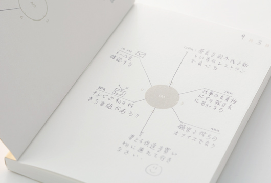
Diary schedules are arranged in lines and grids, which are difficult to see and has little flexibility. This notebook makes it clear, intuitive and easy to plan and see your daily schedules.
Cool Hunting’s brief write-up on it gives us a qualitative insight on how useful it can be, and how different it can be to what we have been used to:
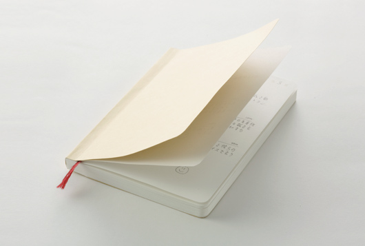
Beige, minimal, with rounded corners and just small enough to fit in your pocket, the Chronotebook has trademark Muji aesthetic appeal. The clock, located in the center of an open page, is divided in halves by the midline of the book—the left hand white graphic represents AM, while the dark graphic on the right is PM. Not only does the layout illustrate our circadian nature but it forces you to organize tasks according to the time of day they need to be done. Overall, it’s easy to look at, simply comprehended and accomplishes a design feat by adding a small feature (a more logical way to break up your day) that has big rewards in functionality.
Anyways, thought I’d share with those of you looking for a new way to organize or log your day, etc.


