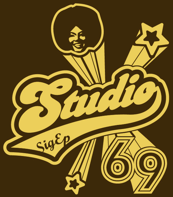
Well… since they are handing out the shirts today, I guess there is no harm in showing them—the rough sketch.
Update
I finally got around to updating this post since moving it from MovableType to WordPress. Anyways, it was using a popup-window. Figure I just put this under one roof. Meanwhile, I did have some notes on this piece as well:
- Colors: earth-tones (mid-brown color shirt, with dull-bold gold/yellow for print)
- Might use glittery-ink for the girls shirt’s gold/yellow ink
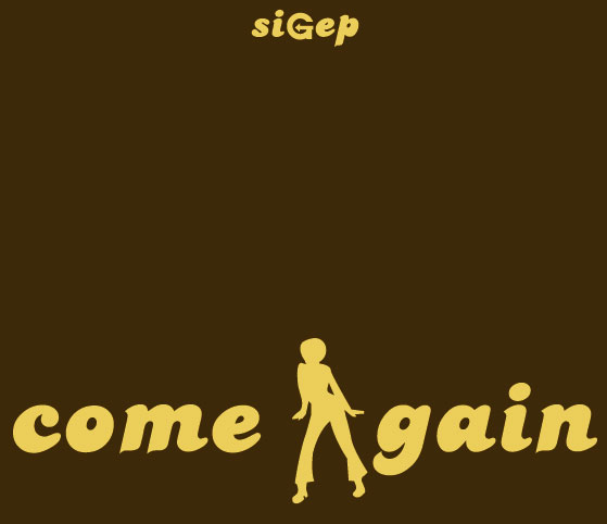
- About the back-design: “siGep” is up-top middle. “come Again” is mid-center of the back.
Here’s a layout shot in terms of design-positioning on the shirt:


